
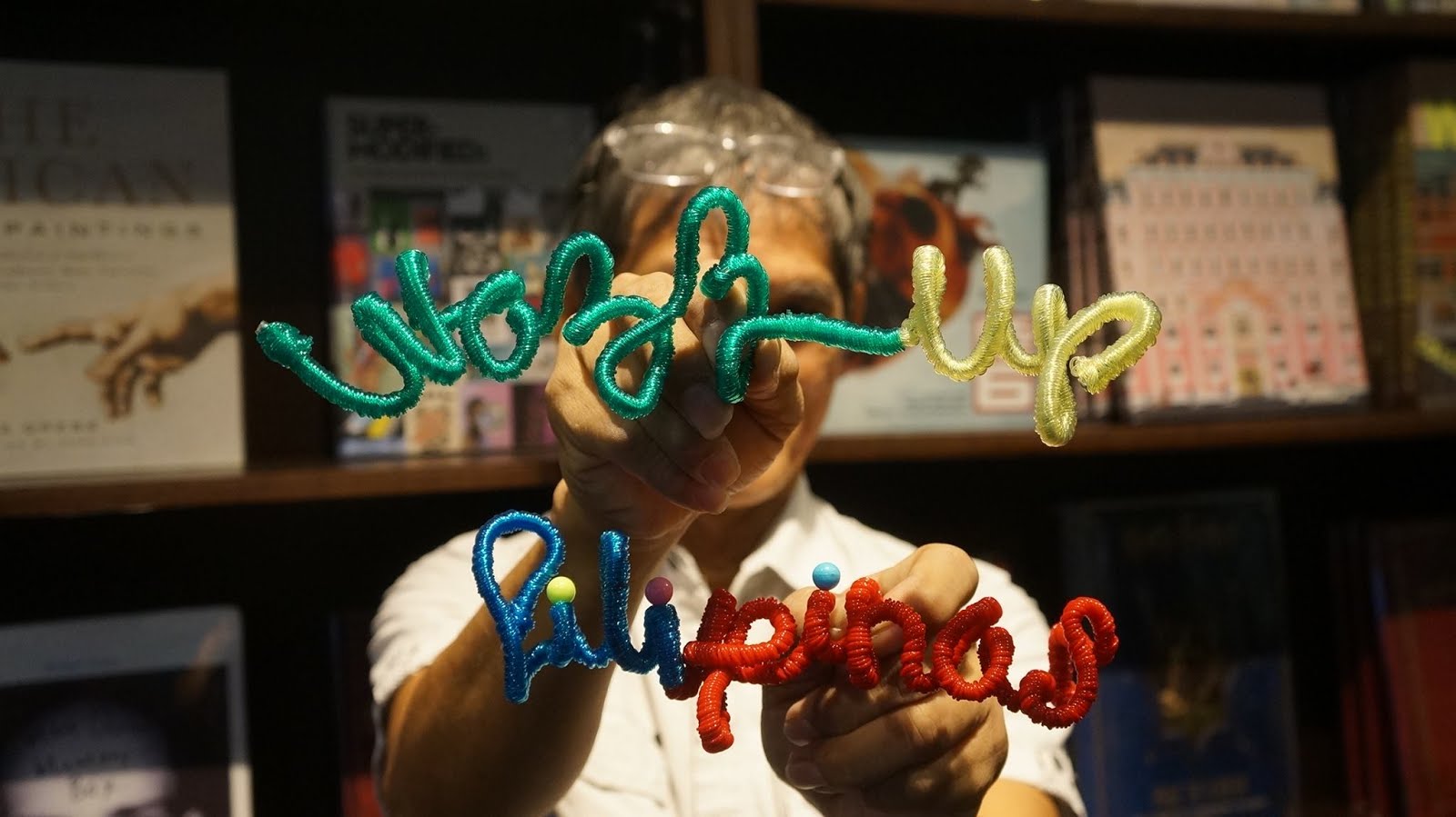
Wazzup Pilipinas!?
The components (sun, ocean waves, coconut tree, island) of this logo created by ChatGPT looks like it was based from my original logo that was created years ago.
The Wazzup Pilipinas logo was made more than 10 years ago by a graphic artist/designer that we commissioned. He was referred by a fellow blogger. But do you think that it's high time for us to create a new logo design?
Could anyone make a better version to keep up with the constantly changing and evolving times?

.png)
.png)
The Wazzup Pilipinas logo was made more than 10 years ago by a graphic artist/designer that we commissioned. He was referred by a fellow blogger. But do you think that it's high time for us to create a new logo design?
Could anyone make a better version to keep up with the constantly changing and evolving times?

Original design of the logo was with a coconut tree:
.png)
The artist removed the coconut tree on the final design leaving only the three flag colors of red, blue and yellow.. He improved the rays of the sun as well and made the color blue of ocean waves similar to that of the letterings of Wazzup. The word Pilipinas is red. He played with the combined but still separate letters W and P creatively to come up with this amazing logo.
As the founder of Wazzup Pilipinas, I believe the time is right to consider evolving our logo to reflect the growth and maturity of our platform. Wazzup Pilipinas has been at the forefront of Filipino digital media for years, and with our expanding reach, we need a logo that speaks to our present and future while maintaining the essence of who we are.
When to Change the Logo
Reflecting Our Growth:
We’ve come a long way since our early days, and as we expand our content offerings and partnerships, now is the perfect time to refresh our logo. This is more than just a redesign; it’s about signaling to our audience that Wazzup Pilipinas is moving forward, adapting to changes, and staying relevant in an ever-evolving digital landscape.
Milestone Moments:
With significant milestones on the horizon, such as our upcoming anniversaries and the growing influence of our platform, it makes sense to align a new logo with these important events. This not only gives us a chance to celebrate our journey but also positions Wazzup Pilipinas as a forward-thinking brand.
Keeping Up with the Times:
The digital world moves fast, and as we continue to make our mark on platforms like Instagram, YouTube, and other social media channels, our logo needs to reflect the sleek, modern aesthetics that dominate today’s media landscape. Our current logo served us well, but it’s time to modernize and stay ahead of the curve.
How We Can Improve the Logo
Evolution Over Revolution:
Wazzup Pilipinas has built strong brand recognition, and we don’t want to lose that. Instead of a complete overhaul, I suggest evolving the current logo. We can keep elements that resonate with our audience—like key colors or symbols—but refine them for a cleaner, more contemporary look.
Simplicity is Key:
As we continue to engage across various platforms, especially mobile and social media, a simplified, minimalistic logo will help ensure our brand is recognizable everywhere. A more streamlined design that works across different formats, whether it’s on a YouTube video thumbnail or a social media avatar, will make our identity even stronger.
Cultural Connection:
Wazzup Pilipinas is proud of its roots in Filipino culture. While modernizing the logo, I’d like to see subtle nods to our heritage, whether that’s through the use of traditional patterns, symbols, or fonts inspired by local art. This way, we remain true to our identity while staying fresh and modern.
Adaptability and Versatility:
Our new logo should be versatile enough to work on everything from our website to merchandise. It should look just as impactful in black and white as it does in color, and it needs to scale well across all sizes and platforms. This flexibility will ensure Wazzup Pilipinas stays recognizable in any context.
Maintaining Our Energy:
Wazzup Pilipinas has always been about vibrancy, energy, and a forward-looking spirit. The new logo needs to capture that same dynamic vibe while still feeling professional and credible. Whether it’s through the choice of bold colors or a playful, yet clean design, the logo should reflect the lively nature of our content and community.
Involving the Community:
Wazzup Pilipinas has always thrived because of our strong connection with the community. That’s why I think it would be great to involve our audience in the logo redesign process. We could host a logo design contest or ask for feedback on a few design options. Not only will this create buzz, but it will also make our community feel like they’re a part of our journey.
Updating the logo isn’t just about making things look better; it’s about positioning Wazzup Pilipinas for the future while staying true to our origins. By keeping the core identity intact but refining and modernizing the design, we can ensure that the brand remains relevant and continues to resonate with our growing audience.
.png)


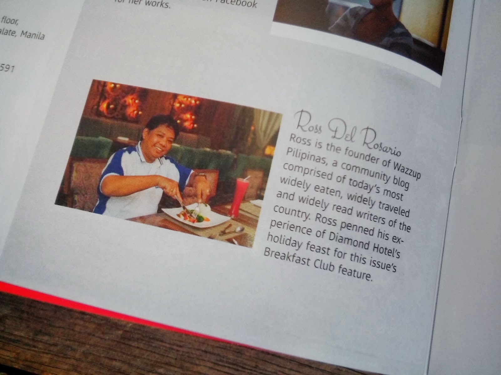
 Ross is known as the Pambansang Blogger ng Pilipinas - An Information and Communication Technology (ICT) Professional by profession and a Social Media Evangelist by heart.